I decided to go for the same look on the front cover of my magazine as I had with my film poster, that way people could associate them with each other and it would be easily recognised. So I decided I would go for the same background as my film poster. Once the background was on I needed a name for my magazine so I went for Film Review as it's simple and makes certain that it is a film magazine, I then needed to make sure that the masthead was clearly visible so I needed a stand out colour, I decided on red because it went well with the black, the only thing was that the edges weren't bold enough and it didn't look like it stood out so I gave it a light grey border which makes it much more visible.


After getting the masthead to stand out I started to work on the very top of the magazine cover and I gave it a skyline, I thought of many things that I could include here and I decided to include my friends film trailer title into it, and so my skyline shows that you can get a free 'Inheritance' poster.

Once the skyline was in place I thought it was time to add my headline, the headline off my magazine cover is the title of my film therefore I imported my title in and placed it in the conventional place of where the headline goes which is about a quarter of the way up the page. I spread the headline across the whole landscape of the page to make it stand out more and make sure that it would be clear to the customer which film is being spoken about.

After I had added the headline I also decided to add some teasing content as well along the bottom so I thought just to make the writing stand out I would make sure that there was a definite black background so I added a black strip at the bottom so the white writing was made more visible. I decided that the teasing content I would add was, extra posters, interviews and competitions, I did this as because it is a film magazine this is what the customer would want to see.

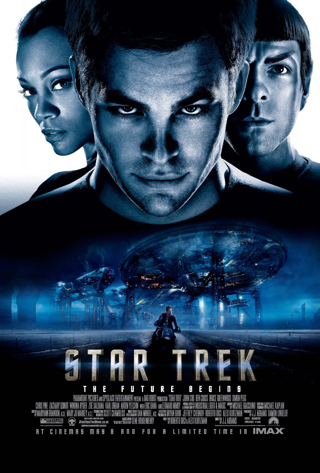
Now that the majority of the layout had now been established it was now time to add the images, I added the exact same ones that were on my film poster as this is what usually happens on a film magazine when they talk about a new film, they usually just take the film poster and use that as the front cover and that is the path that I followed.

Once the images were added I thought it was time to put in what the magazine has to offer about the film, so I decided it would be an interview with the star and therefore underneath the headline I have included a quote from the star and this will intrigue the reader into wanting to read the whole article.

After the quote was put onto the front cover there were still sub-headings to add onto the magazine, the sub-headings had to apply to films as this is a film magazine and they also had to be interesting enough to entice the audience into wanting to read the articles. I also needed them to stand out so in the same way I made the masthead stand out by adding the grey border I did the same to the sub-headings so that they were easily seen.

I thought that I had finished once I had added the sub-headings but then I remembered a key convention to music magazines, and that is a barcode on the front cover, I decided that there was a nice gap to fit the barcode in the bottom right hand corner just above the teasing contents, on the barcode I added the title of the magazine, the price and also the date in which it is released.

Once the barcode was added I decided that I had finished my magazine front cover and that I had produced a magazine cover that includes many conventions and is a good copy of what a magazine cover looks like.