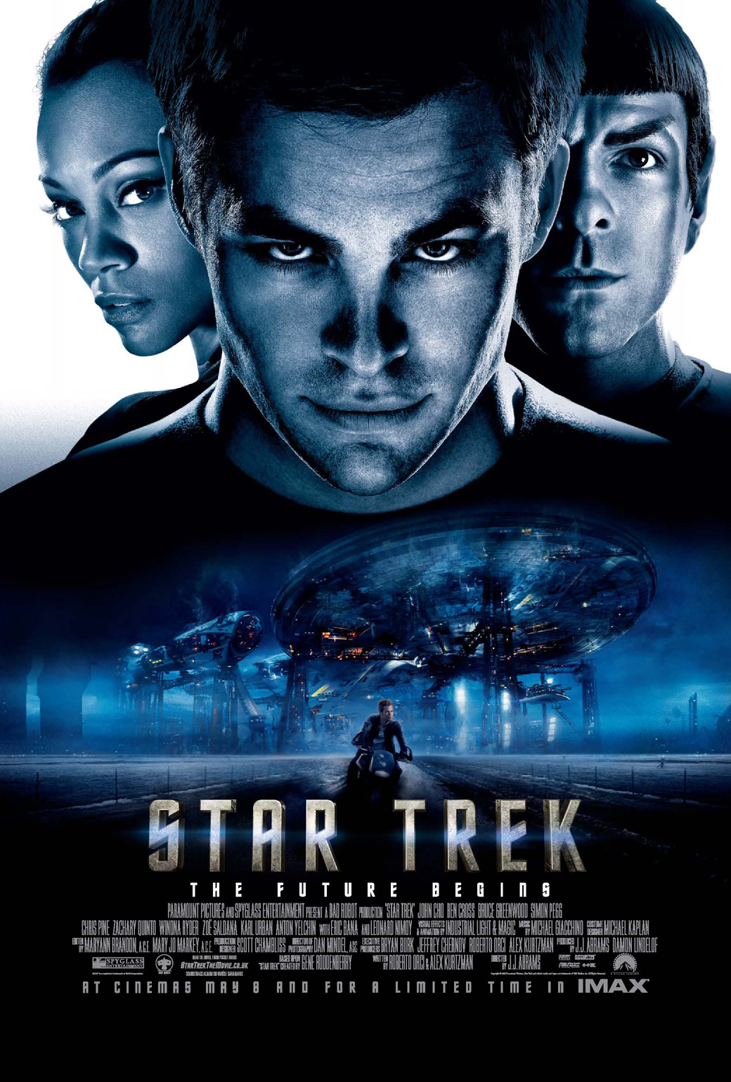
As you can see in my previous post I had a choice of three fonts in which to use in my ancillary texts after I had chosen the one I wanted to use I started on my film poster, I looked at a few film poster such as:


After looking at these I got my idea on how I wanted my poster to look and I started with the layout of it, this ended up looking like this:


After looking at these I got my idea on how I wanted my poster to look and I started with the layout of it, this ended up looking like this:

This shows the main conventions of a film poster as it has the title of the film in the bottom third of the poster which three of the four posters above have. It also has the text at the bottom which shows the actors, producers, director etc. It has the names of the two main characters within the film, which are the ones that will be featured on the poster. It also features a few quotes from reviews to show that the film is good and reviewers want to recommend it.The poster also shows that the film is out this fall, it comes out in the fall as it is a horror and it is more effective in this time period as it is starting to get darker and people will get more hyper reality from it.
I then went on to add an image and background onto it, now because my image and background are mainly black I had to change the colour of all my texts to white so that they stood out as you can see.

After adding this there was only one more image of the protagonist to go onto there and once added I put a black and white gradient onto there as the film is about a mystery creature which is stalking the protagonist so thereofre with the poster being in black and white it adds to the mystery.

This is what the poster looks like with the picture of myself added to it, as you can see the gun is pointing straight at the audience, the reference of this is to 'The Great Train Robbery' which was the first film back in 1903 in which at the end of it a man points the gun at the camera which makes it look like he is pointing it at the audience and shoots, which is like mine where the protagonist is pointing it at the audience.

When I spoke to my teacher about this poster they said they really liked it however as I was infront of Slender and I am the protagonist I should stand out more and therefore said I should try and brighten my face up more so that you can really tell i'm infront. I then went away and took his advice and did this

This is the exact same however I brightened my face and hair, it does make me stand out more however I feel like I may have made it to bright and ruined the image however it does bring me to the front more and make me stand out. I also felt like 'This Fall' was a bit to American to put on my British film poster so I decided I would change it to an actual date. The date I went for is 'Friday 13th September', this is because horrors are usually released between summer and autumn so I went for September which is just in-between those two seasons. The Friday 13th is because that is a date that is renown for being scary and having horror films released on that date.

No comments:
Post a Comment